The API Usage page (Image SEO → API Usage) is where you watch the AI side of the plugin. Every call it makes — single image, bulk run, keyword regenerate, single-field optimize — is written to its own table and surfaced here, so you can see whether the spend matches your expectations and whether a provider is having a bad day.
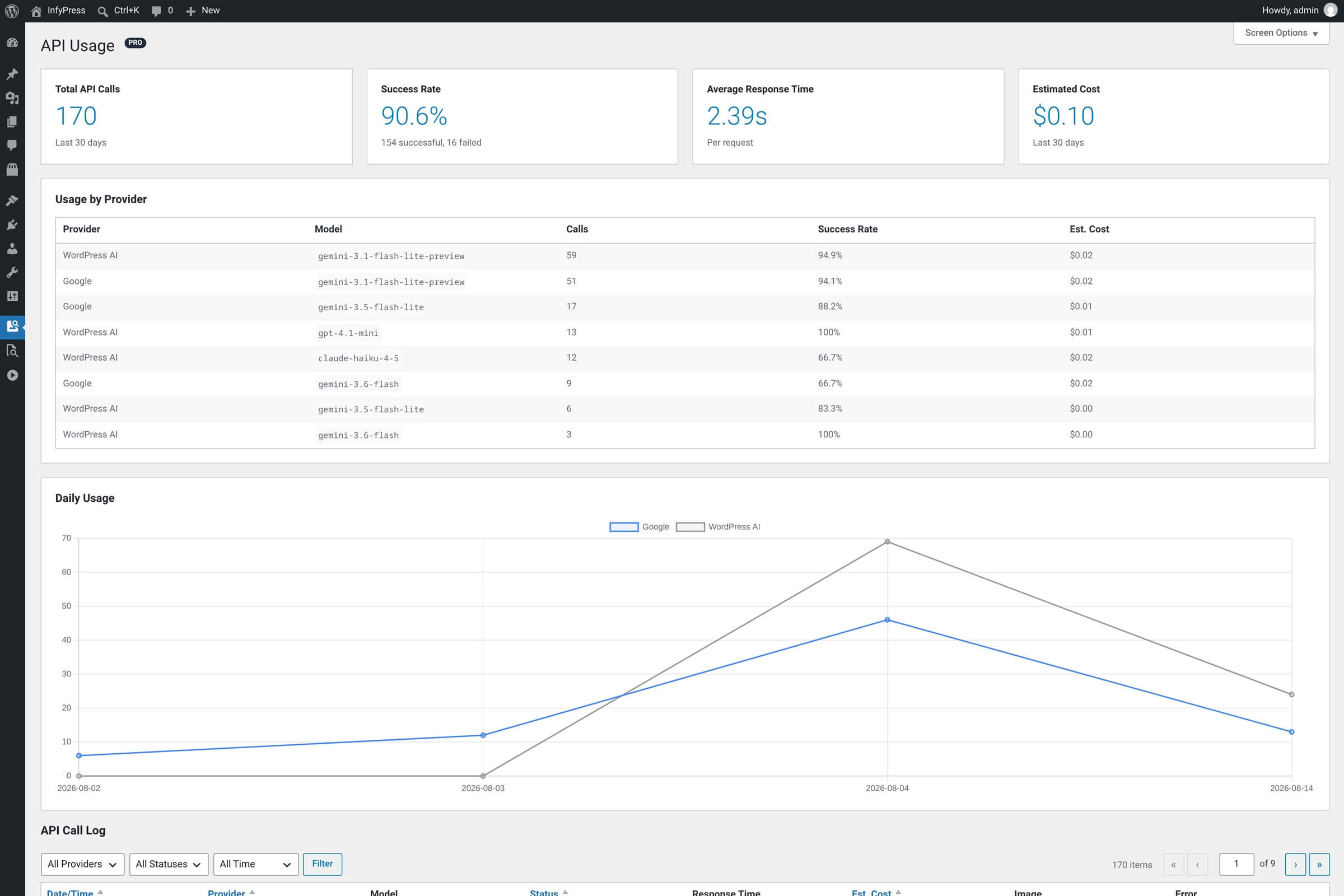
The 30-day summary cards
Four cards sit at the top of the page. They always cover the last 30 days — the date filter on the log below has no effect on them.
Summary cards
| Feature | What it shows |
|---|---|
| Total API Calls Rolling 30-day total. | Every call logged in the window — single image, bulk, keyword generation, and the calls that never reached a provider because a rate limit was already in force. |
| Success Rate Percentage, with the raw counts beneath it. | Successful calls divided by total calls. The line below reads x successful, y failed. A steady drop points at an expired key or a provider throttling you. |
| Average Response Time Seconds per request. | Mean time the provider took to answer, measured around the request. Useful for weighing a slower model against a faster one, and for spotting a network problem. |
| Estimated Cost USD, two decimals. | Sum of the per-call estimates in the window. An estimate the plugin computes itself — not an invoice. |
Rate-limited calls count in the total but in neither tally
A call that was blocked by a rate limit is logged with its own status. It counts toward Total API Calls and pulls the success rate down, but it appears in neither the successful nor the failed figure underneath. If those two numbers do not add up to the total, that is the difference.
Usage by provider
Below the cards, the Usage by Provider table breaks the same 30 days out into one row per provider and model, sorted by call count. Columns: Provider, Model, Calls, Success Rate, Est. Cost. The whole table is hidden when nothing has been logged in the window, and the figures are cached for five minutes.
Switching models or running a short A/B test shows up here cleanly. It is the one place where you can compare what Claude 4.5 Haiku and Gemini 3.1 Flash-Lite cost on your own library, at your own image sizes, rather than on a marketing page’s example.
The Model column records what answered, not what you picked
Each row names the model that actually served the request. With WordPress AI connectors active, your model choice is only a preference — when WordPress routes the request to another connected provider’s model, the log records that model. Those rows carry the provider name WordPress AI, a fourth provider alongside Anthropic, Google and OpenAI, and it appears as soon as one call has gone through a connector. Only successful calls carry the serving model; a failed call is logged under the model you selected, because nothing answered.
How the cost number is calculated
Each call gets its cost at the moment it is logged: the model’s blended price per million tokens, multiplied by the call’s token count, divided by a million. The blended prices come from the plugin’s own model registry — $2.00 per million tokens for Claude 4.5 Haiku and $0.56 for Gemini 3.1 Flash-Lite, as registered in 1.0.6. On a Pro site one full optimization writes three rows here, not one: the base call, then the caption and the description. They carry the same image and model, and no column tells them apart, so the row count runs at three times the image count.
The token count is the plugin’s estimate, not a provider-reported figure: 1,000 tokens for the image analysis plus roughly one token per four characters of generated text. On that baseline, one image lands near $0.002 with Claude 4.5 Haiku and near $0.0006 with Gemini 3.1 Flash-Lite.
Cost is an estimate, not a bill
Two things keep the number approximate. Tokens are estimated locally rather than read back from the provider’s response, and a model the registry does not know — including a model a WordPress AI connector substituted — is priced at the fallback rate of $1.00 per million tokens. Providers also prorate, round and apply free-tier credits that nothing here can see. For what you actually owe, read the provider’s own billing page: Anthropic Console, Google AI Studio, OpenAI Platform. This number is reliable for relative comparisons and budget tracking, and for nothing else.
Daily usage chart
Under the per-provider table, the Daily Usage chart plots one line per provider across the last 30 days, oldest day first. Spikes are bulk runs; a flat low line is organic single-image work. Use it to confirm that a bulk run actually fired, or that a quiet day really was quiet. The chart plots call counts only — cost is summed in the cards, never drawn here.
The detailed call log
At the bottom of the page, the API Call Log lists every individual call, newest first. Eight columns:
Log table columns
| Feature | What it shows |
|---|---|
| Date/Time Sortable, the default sort. | When the call was made, in your site’s date and time format and timezone. |
| Provider Sortable and filterable. | Anthropic, Google, OpenAI, or WordPress AI for calls routed through a connector. Extensions that register their own provider appear here under their own name. |
| Model Model identifier. | The model that served the call, printed as code. Under connectors this can differ from the model selected in settings. |
| Status Sortable and filterable. | Success, Error or Rate Limited, as a colored badge. Calls that were retried show the retry count in brackets. |
| Response Time Seconds, two decimals. | How long that one call took. Outliers point at a network or provider hiccup rather than at the model. |
| Est. Cost Sortable, four decimals. | The per-call estimate described above. An em dash means no cost was recorded for the row. |
| Image Thumbnail. | The attachment the call was made for, linking to its edit screen. An em dash for calls not tied to one image. |
| Error Failures only. | The provider’s message, trimmed to 10 words, with the full text in the hover title. This is where rate limits, auth failures and timeouts identify themselves. |
Three dropdowns above the table filter it: provider, status, and a date range of Last 24 Hours, Last 7 Days or Last 30 Days. The range defaults to All Time, so the log can reach further back than the cards above it. Screen Options sets how many rows per page, starting at 20.
On small screens the tables become cards
Since 1.0.6 both tables on this page adapt instead of overflowing. At 782 pixels and below — phones and portrait tablets — each row collapses into a card with the column name printed beside every value, and the filter dropdowns stay visible rather than being hidden behind a toggle. Above that width the table keeps its columns and scrolls sideways inside its own container, so the rest of the page stays put.
Log rows are deleted after 90 days
A daily maintenance task removes every row older than 90 days from the usage table. Nothing warns you before it runs and there is no export button, so anything you need for a longer record has to be copied out before it ages out. The table is dropped when you uninstall the plugin.
Global stats, not per-user
The page aggregates calls across every user on the site. If several administrators run optimizations, the cards cover all of them together, and there is no per-user filter. The per-user limit of 100 optimizations an hour still applies at call time — it just is not a column here.